I recently attended the Canadian Library Assessment Workshop, hosted this year at Western University. This was my fourth CLAW (I still get emails from the hotel in Victoria from CLAW 2017, anyone else??) and I always come away inspired and motivated to up my assessment game (and then I get dragged down by the daily demands of my job and usually don’t have time to try anything new). But this time, I have some new tools I want to try, I’m all fired up on process mapping, I have a lot of thoughts about how we communicate the results of our assessments and tie them into our strategic priorities, and I have a bunch of pages of notes on inferential statistics and data modelling that I might end up using to turn the bulk of this blog post into a paper (#FancyStats). Also: I talked to a lot of great and interesting people, the Western campus is really gorgeous in October, and CLAW always serves hot breakfasts!! (You need your morning protein to get through all this high-powered assessment stuff.) So, there’s my review. The only downside was that the Access conference was happening at the same time so I didn’t get to attend that one.
CLAW’s theme this year was assessment in a time of change, leading me to give my presentation the somewhat fanciful title Usage Statistics in Times of Technological Disruption: Case Studies of Changes in Interface Design and Usage Patterns at Scholars Portal. (Well, the first part is somewhat fanciful, the second part is somewhat dry. Titles! What can you do.) This is a topic I’ve been turning over in my head for a while, and I still don’t think I fully know how I feel about it. Having to put together the presentation (and then translate it into French because I missed the translation deadline, realize that my English slides were incoherent, go back and fix them, rinse and repeat) helped me clarify some of my thoughts, but then the 20 minutes of presentation time weren’t enough, so here I am logorrhea-ing my thoughts at the interwebs. I still think I have more questions than answers but I’m starting to get at some kind of central thesis.
A disconnect in usage statistics
Okay, we’re starting with incoherence right off the bat, because I have tried to phrase my next sentence about a dozen times and it never comes out quite right!
I think there’s a disconnect between where usage statistics come from and how people tend to use/treat them — or what people think that they mean.
I’ve been sort of circling this idea for a while, starting with the lead-up to the COUNTER 5 launch, and I talked a bit about this in my Learn with Scholars Portal webinar on stats and analytics. The experience of taking the COUNTER standard and making a platform conform to it was intense and almost transformative? I don’t think many people realize how much human labour, and human decision-making, go into this type of usage stat generation. We spent a lot of time going through the Scholars Portal Journals platform and identifying what actions would result in an item_investigation (item_request is much more straightforward) and then going through our actual server logs and comparing them to our usage reports to make sure that our “unique” uses were processing properly and our double-click filters were working properly and all that. There were two of us working on it, mostly off the sides of our desks, and it was an iterative process that took months. And there are still things that come up that we’re not sure how to handle in COUNTER–not to mention, system updates can cause errors in usage stats scripts in unexpected ways.
A lot of the criticism of publisher-provided usage statistics puts weight on this human element, as in: “Do Download Reports Reliably Measure Journal Usage? Trusting the Fox to Count Your Hens?“. The idea is, I think, that publishers are maliciously making choices to boost their usage stats while remaining technically COUNTER compliant. While that may be true in some cases–and I’ll talk a lot about user interface later–from my experience trying to wrangle a site into COUNTER compliance and keep it there, it’s complicated to make these kinds of changes and it’s very easy for something to go wrong accidentally.
My own stance is closer to Terry Bucknell’s “Garbage In, Gospel Out: Twelve Reasons Why Librarians Should Not Accept Cost-per-Download Figures at Face Value“. Says Bucknell: “The phrase ‘garbage in, gospel out’ has been coined more recently to express the tendency of people to trust numbers at face value without question. If you attach a number to something, it becomes the gospel truth.” Bucknell gives a number of reasons why your COUNTER data may in fact be “garbagey”. Even if it isn’t, I would add that no system is perfect. There are a few COUNTER-approved ways, for example, to identify whether or not a user is truly unique. The only way that provides 100% accuracy is the one that requires users to be identified with an account on the provider platform, which is bad for both user experience (one more thing to get through to get your stuff!) and user privacy. COUNTER estimates that there can be a 1-2% variation in those uniqueness counts based on which of their approved methods you use. So, very tiny, but my point is: even data that rigorously follows the COUNTER standard isn’t “perfect”. And it’s not because Evil Publishers Secretly Plot To Make It So. (Well, not entirely.)
Platform design and usage
Okay, now we’re getting somewhere. We all agree that usage stats aren’t “perfect” and in fact are subject to errors both human and technological.
One thing that COUNTER doesn’t do well is report on how the *platform* is used. This isn’t a criticism of COUNTER–it’s not trying to report on how people use the platform, it’s trying to report on *how much* people use the *content*. (Yes, there are search-related metrics, but they’re very broad so ymmv.) In order to do this in a way that is comparable across as many platforms as possible, it flattens all the different ways that users can interact with content on a platform into a small number of metrics, basically: did the user interact with this content at all? (investigations) or did the user access the entirety/fulltext of this content? (requests)
There are, of course, a lot platforms that let you do things other than simply read full text, and providers might give you statistics about these but COUNTER won’t. This is most true for nontextual content, so if you’re looking at a platform that offers video playback or some kind of tool for interacting with the content (like some data repositories), I would recommend looking at the provider’s own stats in addition to COUNTER so you can get a fuller picture of *how* people are using this content.
On a more general level: don’t treat COUNTER stats like they’re telling you more than they are. I heard someone say recently with complete confidence that researchers prefer to use a particular publisher platform because they like to use the “related articles” feature. I have no idea where they get that level of confidence because I can say with absolute certainty that this publisher has not provided them with stats on this, and I highly doubt they’re asking researchers about it in any kind of rigorous way. Anecdotes are not data, and COUNTER data does not give you any information about the “related articles” feature!
(I mean, I wouldn’t be surprised if recommending related articles bumps up the usage stats, simply because it encourages more clicks, but I don’t have any actual data on this, and also even if I did have data it would not tell me anything about whether the people who have used it actually like it.)
So, then. Does platform design influence the usage of the content? It makes intuitive sense, right? I mean, probably yes, but COUNTER data can’t actually tell you anything about this on its own.
A lot of the literature in this area (and both the articles I’ve already mentioned here cover this) focuses on the “double-counting” aspect in COUNTER 4 and earlier versions. To wit: if your user clicks on the title of an article, from a table of contents or clicking through from their library link resolver or discovery layer or what have you, they can either (a) land on a landing page with the article abstract (from which they have to click through to read the full text in either PDF or HTML) OR (b) they can land on a page that includes the full text in HTML, where there may also be a PDF download option. Option B, sending people straight to HTML fulltext, has the potential to overcount actual usage fairly significantly. Librarians dealt with this by creating ratios of HTML:PDF usage (or vice versa). HOWEVER, this well-known problem has mostly been corrected by the introduction of “unique” metrics in COUNTER 5.
That leaves us with… COUNTER data that is as comparable between platforms as possible, to the extent that it sometimes sort of elides the differences between the platforms themselves and provides the illusion that platform differences *don’t* matter.
The (in)convenience factor
When I started looking into the literature, I blithely assumed I would easily find numerous papers proving that when students are presented with a list of things on a library website or libguide or what have you, they almost always just click the first option. Oh the naïveté of yestermonth. If such an article exists, I have yet to uncover it. (although, to be fair, I stopped looking very hard once I got distracted by what I *did* find. If anyone does have an article like this, send it my way!)
Here’s what I ended up with: “’If it is too inconvenient I’m not going after it:’ Convenience as a critical factor in information-seeking behaviors,” by Lynn Sillipigni Connaway, Timothy J. Dickey, and Marie L. Radford. If you’ll forgive their emphasis on millennials (they wrote this when we were still making up the vast majority of undergrad programs! it wasn’t that long ago even if it feels like it!), the authors argue convincingly that time and convenience are huge factors in information-seeking behaviour. To the point that, as the quote they picked for the title suggests, students won’t make an extra effort to access an inconvenient resource, when there is a “good-enough” resource that’s easier for them to get to.
This is another thing that makes intuitive sense to think about, but we do still need actual evidence to prove it! This study, and other studies on convenience like it, often focus on the convenience of physical vs. electronic resources, or the ease of use of Google vs. the library OPAC. But can the same findings be applied to the ease of use of electronic resources as discovered through the library?
Michelle Swab’s study “Connecting Users to Articles: An Analysis of the Impact of Article Level Linking on Journal Use Statistics” looked at full-text linking from a discovery layer (in this case, Primo/Alma). Through the use of some #FancyStats Swab shows that journals with article-level linking (that is, individual articles are discoverable in Primo and clicking on them will take you straight to the right article) receive over 90% more use than journals with title-level linking (i.e. links from Primo take you to the journal homepage and you have to go through and find the article for yourself). 90%!!!!! Take that, people who say our users are just finding stuff through Google Scholar!!!
So… hmm… who do we know who has eresources, where there may be changes to the convenience/ease of access, and who is also not a Big Bad Evil Vendor Out to Inflate Usage?
Who indeed?
Case Study #1: Scholars Portal Journals & Full-Text Linking
Backing wayyyyyyy the heck up, Scholars Portal is the technological infrastructure arm of the Ontario Council of University Libraries (OCUL), and one of our major technological infrastructures is a locally hosted platform of journals licensed by OCUL and CRKN. (Mostly CRKN.) I won’t get into how it works (although you can read about it elsewhere if you want) but the salient points:
- we are in the somewhat unique position of being both a library organization and a content provider, which gives us some interesting perspectives and opportunities when it comes to collections analysis
- the SP Journals platform contains full-text journals from nearly all of the major publishers
- (almost) all of the content on SP Journals is also replicated on the publisher platform, so, if you have an Elsevier subscription, you can read the same article on either Science Direct or Scholars Portal
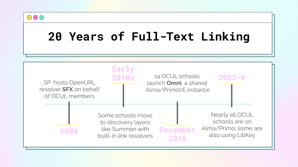
One of the other technological infrastructure things Scholars Portal has done is that we used to host an SFX instance on behalf of our member libraries to facilitate full-text linking. One of the benefits of hosting it was that we could also very easily maintain the knowledgebase of collections on our own platform. Aaaaand when there are multiple full-text sources for the same thing (almost always true for our journal content) SP Journals was first on the list.

(as an aside, this image showcases three different things that SP does/did that are all being replaced by Alma functionalities, so, 😦 )
And then in mid-December 2019, so close to the winter break that let’s just call it a dividing line between 2019 and 2020, 14 of the 21 OCUL schools migrated to a shared instance of Alma/PrimoVE, which comes with its own link resolver and knowledgebase. When more than one service provider is available for full-text, PrimoVE defaults to alphabetical order. You know what letter comes pretty late in the alphabet? S!
The timing of this is… awkward, what with everything that happened in 2020. But, still, a good opportunity to test that people-click-the-first-item-in-the-list thing!
Change in usage on Scholars Portal Journals between 2019 and 2020 by publisher collection & migration status
| Collection | Elsevier | CRKN Wiley | CRKN Springer | Taylor & Francis |
|---|---|---|---|---|
| Schools that migrated | -84% | -72% | -71% | -40% |
| Schools that didn’t migrate | -23% | +2% | -11% | -20% |
So! Let’s get into it.
I’ve only shown a few publishers here, but there was an overall decrease in usage on SP Journals (here based on COUNTER 5 unique_item_requests, the gold standard for journal usage) between 2019 and 2020. Some of that could have been pandemic, but as you can see by looking at the schools that migrated vs. the schools that didn’t migrate, migration was definitely a factor.
Schools that migrated to Alma in December of 2019 saw a pretty significant decrease in usage on SP Journals overall. Partly that’s because it took a while to make sure all of our content was properly represented in the Alma KB, and partly that’s because not all the schools activated our collections from the KB as soon as they were available. But here is where it’s telling to look at individual publishers. Three of the publishers here show up before SP Journals in the alphabetical order listing of electronic service order (Wiley and Springer would normally come later alphabetically, but their collection names in the Alma KB are “CRKN Wiley” and “CRKN Springer” to reflect the consortial deal). The decreases for these publishers are very steep. On the other hand, Taylor & Francis comes after Scholars Portal in alphabetical order, and the decrease in T&F usage wasn’t nearly as significant. While the non-Alma schools do see some differences between publishers, they aren’t nearly as stark, and they don’t map along the same lines as the Alma schools.
Conclusion: Yes, people click the first thing in the list.
To dig a little deeper, I looked into the stats of a school that made an adjustment to the default order in PrimoVE to prioritize Scholars Portal Journals as much as possible. Their usage of Elsevier content went up by 185% and their usage of Wiley content went up by 168% over the previous year (in which they were on Alma/PrimoVE but using the default alphabetical order). Meanwhile, their T&F usage only went up very slightly, by 11%, because SP was already ahead of T&F on the list.
I also looked at a school that has implemented LibKey, which facilitates linking straight from PrimoVE to the full-text PDF. LibKey doesn’t follow the service order in PrimoVE, it has its own algorithm for checking available full-text sources, and usually the publisher site gets priority.

Sure enough, this school saw a big drop in their usage on SP Journals after implementing LibKey. Before their LibKey implementation, they had configured PrimoVE to prioritize SP Journals over some (but not all) publishers. After implementing LibKey, their Elsevier usage on SP went down by 54%, Wiley usage by 80% and T&F usage by 60%. I think Elsevier saw a lesser decline because SP wasn’t getting the boost over the publisher platform in PrimoVE, so it didn’t have as far to fall.
So what does it all mean?
I mostly started this journey wanting to prove that service order in a discovery layer or link resolver matters at all. And I think it does! We changed a thing and it changed our usage patterns, so clearly people aren’t all getting to our content from Google Scholar! Also, people click the first thing in the list, dammit!! Even if the convenience difference of scrolling down an extra second is minimal, if you know you’re getting the exact same article no matter which link you click, why would you bother scrolling? (That is rhetorical, I know there are occasional use cases.)
But the big question I have, looking at these numbers, is: when we see a decline in usage for a particular publisher on SP (or another aggregating platform), are you seeing a corresponding increase in usage on that publisher’s own platform? And when you see that increase, what do you think it means? Are you merging your stats for the same title from different sources? Or are you making decisions about renewals and cancellations based just on usage from the publisher platform?
So, here is my takeaway for you, if you do this kind of work: if you’re making a change to how discovery or full-text linking work (like, say, implementing LibKey), expect some fluctuations in usage patterns. Also, combine usage for the same title/publisher across platforms or you’re missing the full picture.
Case Study #2: Scholars Portal Books and Ease of Accessing DRM-Protected Ebooks
DRMMMMMMM. Every librarian’s least favourite.
Scholars Portal Books is a platform of licensed ebook content, maintained by Scholars Portal (see above at the top of the first case study for more about Scholars Portal).
In this case study, I wanted to focus on a specific collection on the SP Books platform that has some unique features: the Association of Canadian University Presses (ACUP) ebooks.
So a couple of things that make the ACUP collection interesting:
- it’s a CRKN deal and there are subscribers outside of OCUL
- until a change in distributor last year, there was no dual access on a publisher site. Some of these titles were not available in e format anywhere other than SP Books, while others could be licensed by an ebook vendor under a separate license than the CRKN-ACUP-OCUL agreement
- the individual presses could choose to apply restrictive DRM to new titles that they expected to be course-adoption books, mostly single-user restrictions
- the presses could change an existing title’s DRM status to become less restrictive, but not more restrictive (so a title that started out single-user could be converted to multi-user after a few years)
Back when we first started offering this collection, the SP Books platform had no built-in way to manage simultaneous users. To enforce the single-user restriction, we used Adobe Content Server. That meant that in order to download a single-user title, you had to:
- click “borrow this book”
- download Adobe Digital Editions (or similar software)
- create an account/Adobe ID (if you didn’t already have one)
- authorize your device
- download the file to your device and open it in the approved software
Like, jeeze. How many people gave up halfway through that process? Decided the book wasn’t worth it, they’d just use some Google Books snippets or see if the library had a print copy or even use another source entirely?
And then once you’d successfully opened the book, you could return it whenever you wanted (with some extra steps) or ride it out till the loan expired after 72 hours.


On top of all that hassle, if you’re familiar with ADE at all, you may know it’s a very buggy software with almost no help documentation available online! The amount of time I spent troubleshooting ADE problems when I started this job, my god. Preparing this section of the case study gave me trauma flashbacks.
Anyway, the legacy ebook platform didn’t work very well for a lot of reasons by this time, and so we built our own new ebook platform from scratch. Because we knew this use case existed, we built in a mechanism to handle simultaneous user control in the new platform.
The new platform launched midway through 2018, and the experience of opening a single-user title is exactly the same as the experience of opening a multi-user title (as long as no one else is using it at the time): you just click on the title and it opens (or if off-campus you’re directed to a login screen, and then once you’re logged in it opens). It just opens!!!!! I joked that this process meant going from 14 clicks to 1 click to open a book, but I haven’t actually counted, it may be more. Also titles are now “returned” after 10 minutes of inactivity.

So. We have the exact same agreement specifying that some titles are restricted to a single user at a time. The DRM itself hasn’t changed but the process of actually accessing the DRM-protected books has. Any guess what that did to our usage stats?
Unique uses* per ACUP title: old vs. new Books platforms
| Year/platform condition** | 2016 (old platform) | 2017 (old platform) | 2019 (new platform) | 2020 (new platform)**** |
|---|---|---|---|---|
| Multi-user titles | 3.27 | 4.01 | 3.24 | 4.53 |
| Single-user titles*** | 2.29 | 2.28 | 10.36 | 7.02 |
*Uses are unique_title_requests based on the COUNTER 5 standard. This is not the use across all subscribers–I picked a sample of 7 institutions that hadn’t purchased a 3-user upgrade (a whole other thing I won’t get into) by the end of this time period, and who purchased over 90% of ACUP content, so that I could do zero-use title calculations without murdering Excel (or anyone else). Sidebar: I know librarians really love zero-use title reports and I also find them interesting but they are extremely complicated to actually identify for more than one institution/one very contained collection at a time. Maybe a separate future blog post.
**2016 is the first year for which I have good data, and 2020 is the last–because some institutions started buying upgrades to 3 simultaneous users for the restricted-use titles, because of the eventual move to a new distributor, and because they were starting to phase out DRM in general. 2018 is not included because the platform change happened halfway through the year, and we know that eresource usage is heaviest in the fall, meaning that the two halves of the year are not directly comparable in this way.
***As mentioned above, titles could move from single-user to multi-user. I am confident that all the titles have been appropriately assigned on the old platform, because they were tracked differently. On the new platform, however, I had to go back through DRM change logs to try to identify titles that were MUPO in 2021 but had been SUPO in 2019 and/or 2020. I have done so to the best of my ability but there is always a small chance a few titles have slipped through the cracks.
****2020 was a wonky year overall, and also some of the presses opened up some of their content for about 6 weeks during the heart of the lockdowns. But 6 weeks is such a short part of the year, and it happened during a time of year when ebooks don’t get that much use anyway and specifically a time when most people weren’t exactly in a focused headspace anyway. So I’m including 2020 here anyway, but if you want to leave it out feel free.
OKAY now that all of those caveats are out of the way, let’s look at these numbers!
On the old platform, you see that the single-user titles are being used less frequently, on average, than the multi-user titles. It’s not a huge difference, but considering that these titles were selected for restriction *because* they were expected to be high-usage titles, you would expect the single-user titles to be used more, no?
Moving on to the new platform. The average usage stays pretty stable for the multi-user titles–it’s very slightly easier to access them on the new platform, one click instead of two clicks, but that doesn’t seem to be making much of a difference here. On the other hand, the average usage of the single-user titles has shot wayyy up.
The percentage of titles with zero uses shows a similar trend — it stayed about the same on the old & new platforms for multi-user titles, but went down quite a bit for single-user titles.
So what does it all mean?
It seems clear that these single-user titles–which were hand-selected by publishers as likely to be popular titles with high usage–were not reaching their full potential when they were being held back by clunky access methods.
It’s hard to tease out the impacts of the different components here. Our old system, since it didn’t actually handle the single-user access, also couldn’t track turnaways, so we don’t really know how much of a difference it made to switch from a three-day loan period to a ten-minute inactivity window. Also, the trend was moving away from single-user titles–in 2016, 46% of ACUP titles were single-user titles, compared to 38% in 2020. Maybe that means that high usage is more concentrated in those 38% of titles that remain.
But overall: these numbers suggest that ebooks that are convenient and easy to access get used more than ebooks that are inconvenient and hard to access, regardless of the actual contents.
Putting it all together
I have now gone on and on at extreme length and find myself needing to wrap up with some kind of neat conclusion.
The most important conclusion, I guess, is that these back-of-the-envelope type stats do seem to support the idea that user experience and design impact usage. Eresources that are easier to use get used more than eresources that are hard to use.
Also: we were using COUNTER stats the whole way through. COUNTER reports in an agnostic fashion on the usage of content, and in no way purports to tell you how the platform itself interacts with the usage. That’s kind of the whole point of COUNTER. But if you’re working with COUNTER stats, you should understand the limits of what they tell you.
The volume of your usage is only one metric to tell you how useful/valuable the content is to your users. It’s one of the easiest metrics to collect, in part because of how much work has gone into COUNTER stats over the years, but it should be looked at in context. That includes merging your stats for the same content on different platforms as much as possible, and it also means that if your stats are doing something weird, you might want to take a look at the platform the content is on to see if you notice any issues!
I put together some massive datasets for this work and I hope to run some real #FancyStats on them and publish a paper, so stay tuned. In the meantime though–I would love to see more investigation on this topic. Like I said way, way, way back in my intro, I think I still have more questions than answers here.
If anyone else (a) made it to the bottom of this monsterpost and (b) has any thoughts, I’m happy to chat about any of this — find me at @spagotto on most of the social mediums.

Leave a comment